Accessible Color Palettes Need More Than a Passing Contrast Score
Turn contrast checks into a complete color system with readable text, visible states, non-color cues, and tokens that remain dependable across themes.
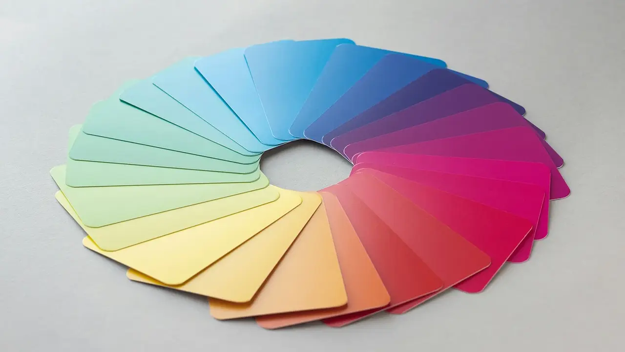
A palette is not accessible because one text-and-background pair passes a contrast checker. Real interfaces combine body text, muted text, links, borders, disabled controls, focus rings, charts, alerts, hover states, and dark themes. Accessibility comes from defining how color behaves across those roles and ensuring that meaning survives when color is not perceived as intended.
Use the utilkit Color Contrast Checker to test every foreground against the background where it actually appears. Save passing combinations as named tokens such as text-primary, text-muted, and surface-warning. A role-based system is easier to audit than a loose collection of swatches.
Start with text roles
Test body text, headings, secondary text, links, button labels, placeholder text, and text inside badges or alerts. Small muted text is often the first failure because designers reduce both size and contrast at once. The W3C explanation of minimum contrast describes the applicable ratios and the distinction for large-scale text.
Do not assume a brand color works as link text on white just because it looks saturated. If the accessible version feels darker than the marketing palette, keep the original color for large decorative areas and create a separate interactive-text token.
Design states as a system
Controls need default, hover, active, focus, disabled, selected, and error states. Check contrast for the label and for any visual boundary needed to identify the control. Focus indicators must remain visible against adjacent colors, including when the component sits on an alternate surface.
Make state changes visible through more than hue. Underline links, add an icon and explanatory text to errors, use patterns or labels in charts, and pair selected color with a border or checkmark. Section 508 guidance on color usage emphasizes that color should not be the only way information is conveyed.
Test combinations, not isolated swatches
A color has no contrast ratio by itself. Test it against each surface it can touch, including cards, modals, tinted alerts, images, and dark-mode backgrounds. Semi-transparent colors require special care because the rendered result depends on what lies beneath them.
Check the interface at different zoom levels and in forced-colors or high-contrast modes where available. Automated audits catch many numerical failures, but keyboard testing and visual review find missing focus, ambiguous states, and content that disappears when styles change.
Create an audit table
- List each semantic token and its allowed backgrounds.
- Record the contrast result for text and essential component boundaries.
- Identify the non-color cue for success, warning, error, and selection.
- Test default, hover, focus, active, and disabled examples.
- Repeat the audit for every supported theme.
Test the palette in real components
A token pair that passes in isolation can still fail once opacity, shadows, gradients, antialiasing, or a parent background changes the rendered color. Build a small test page containing body text, muted text, links, buttons, form fields, validation messages, badges, a simple chart, and focus indicators. Render every supported theme and state on that page. It becomes a repeatable visual fixture whenever a token changes.
Test meaning without color by viewing the page in grayscale or temporarily replacing status colors with one neutral tone. An error should still have text or an icon; a selected tab should still have a shape, weight, position, or underline; and chart series should remain distinguishable through labels, markers, or patterns. This also helps with screenshots, printers, projectors, and poor lighting.
Document approved pairings rather than publishing a bucket of “accessible colors.” For example, record that text-primary is approved on surface-default and surface-raised, while brand-500 is reserved for large decorative areas. Include the tested state and theme. A designer or developer can then see whether a combination is supported instead of assuming that two individually approved tokens automatically work together.
Finally, place the rules next to the design tokens so future components inherit them. An accessible palette is less about finding magical colors than limiting combinations to ones that have already been tested. When the safe choices are the easy choices, the interface stays consistent as it grows.