Color Converter
Convert CSS colors between hex, RGB, HSL, OKLCH, and Lab formats while previewing the selected color and its component values.
The inputted text is too long to include in a share link.
Check foreground and background colors against WCAG contrast ratios for normal text, large text, and common interface states.
Readable text starts with enough contrast between the foreground and background.
Passes WCAG AA and AAA for normal text.
Needs 4.5:1
Needs 7:1
Needs 3:1
Needs 4.5:1
Use this checker before shipping text colors in a website, product UI, design system, email template, or brand asset where readability matters.
WCAG contrast checks compare the relative luminance of text and its background. Normal text needs at least 4.5:1 for AA and 7:1 for AAA. Large text needs at least 3:1 for AA and 4.5:1 for AAA.
These targets are useful for designers choosing palette combinations, developers reviewing CSS, marketers checking campaign pages, and teams maintaining reusable components. A color pair that looks acceptable on one monitor can still fail for users with low vision, glare, older displays, or browser zoom.
When a brand color fails, start by changing the text color or the background behind the text instead of shrinking the text or relying on weight alone. Larger and bolder type can help, but body copy, button labels, form labels, and navigation usually need normal-text contrast.
c_{linear} = \begin{cases} \frac{c_{srgb}}{12.92}, & c_{srgb} \le 0.04045 \\ \left(\frac{c_{srgb}+0.055}{1.055}\right)^{2.4}, & c_{srgb} > 0.04045 \end{cases}
Each red, green, and blue channel is first normalized from 0-255 to 0-1, then converted to linear light.
L = 0.2126R + 0.7152G + 0.0722B
The green channel carries the most weight because human vision is more sensitive to green light.
\operatorname{Contrast} = \frac{L_{lighter} + 0.05}{L_{darker} + 0.05}
The resulting ratio is checked against 3:1, 4.5:1, and 7:1 WCAG text contrast thresholds.
The checker parses the colors in your browser, converts sRGB channels to linear light, calculates relative luminance, and divides the lighter luminance by the darker luminance with the WCAG contrast adjustment.
The suggested fallback chooses a readable foreground option for the current background. It is meant as a practical rescue color, not a full palette generator, so final visual decisions should still fit the surrounding interface and brand system.
The formula, 4.5:1 minimum, and large-text rules follow the W3C Web Accessibility Initiative's WCAG contrast technique. The 7:1 enhanced threshold follows its guidance for Contrast (Enhanced).
Contrast ratio compares relative luminance after foreground and background colors are resolved. The ratio does not depend on hue names or personal preference. Small text generally needs a higher ratio than qualifying large text. The result here applies to the entered pair, so a different background, opacity, gradient position, or overlay creates a different result.
Use the rendered font size and weight when deciding whether text is “large.” CSS pixels, zoom, variable-font weights, and platform rendering can complicate a quick visual guess. When a design sits near a threshold, choose a more generous contrast rather than relying on a borderline classification. Thin letterforms can look weak even when the numeric ratio passes.
The WCAG 2.2 minimum contrast criterion defines requirements for text and images of text, along with exceptions. Non-text contrast separately covers visual information needed to identify controls, states, and graphical objects. Check both when reviewing a component.
Test every interactive state: default, hover, focus, active, selected, disabled, error, and visited where applicable. A button can pass at rest and fail when hovered. Placeholder text, helper text, validation messages, badges, and chart labels are easy to miss. Include dark and light themes rather than assuming one token mapping works in both.
For translucent colors, calculate the composited result over the actual layers. A semi-transparent white label can pass over one part of a photograph and disappear over another. Add a solid scrim, text background, outline, or different placement when imagery changes behind the text. Sampling one favorable pixel is not enough.
Do not use color as the only way to communicate status. Pair red or green with text, an icon, shape, pattern, or position that remains understandable for people with color-vision differences and on monochrome displays. The ratio can pass while two adjacent series or states are still hard to distinguish.
Automated checks cover only the values they can resolve. Canvas content, video captions, images of text, custom controls, and styles that change after interaction may require manual inspection. Test keyboard focus visibility and zoom, and include people using assistive technology when the product risk warrants it.
Save the tested pair with the design token names and component state, not just two hex values. Tokens can be remapped by theme, and a future change can break a previously passing component. Add automated contrast assertions where stable token relationships are part of the design system, then verify representative screens visually.
Built and maintained by utilkit. Updated . Found an issue? Send corrections to contact@utilkit.com
Convert CSS colors between hex, RGB, HSL, OKLCH, and Lab formats while previewing the selected color and its component values.
Crop and resize JPG, PNG, and WebP images in your browser with aspect-ratio controls, dimension presets, preview, and download.
Optimize JPG, PNG, and WebP images for free in your browser, with support for both lossy and lossless image compression.
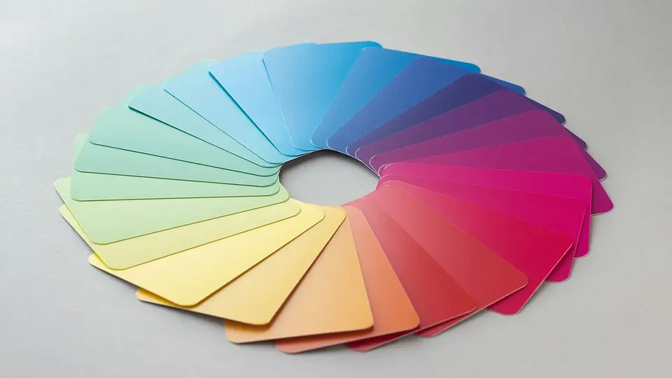
Turn contrast checks into a complete color system with readable text, visible states, non-color cues, and tokens that remain dependable across themes.

Understand what hex, RGB, and OKLCH describe, why perceptual lightness helps build palettes, and how to ship modern CSS colors with practical fallbacks.